The queue economics of vulnerability work
We have reached the point in vulnerability management where the arithmetic is public and it rules out the strategy most programs still use. In 2025 the CVE Program published 48,185 identifiers, roughly 131 per day, up 21 percent year over year, and CVE volume grew another 45 percent in the first half of 2026 (VulnCheck 1H-2026 state of exploitation). NIST now forecasts between 50,000 and 70,000 new CVEs for 2026, with submissions up 263 percent against 2020, per its own April 15, 2026 operations update. On the service side, the Edgescan 2026 statistics report puts high and critical MTTR at 54.81 days for application and API findings and 39 days for network and device, with 45.4 percent of findings unresolved at twelve months, and the Verizon 2026 DBIR across roughly 13,000 organisations reports median time to full remediation of 43 days and full CISA KEV remediation at only 26 percent.
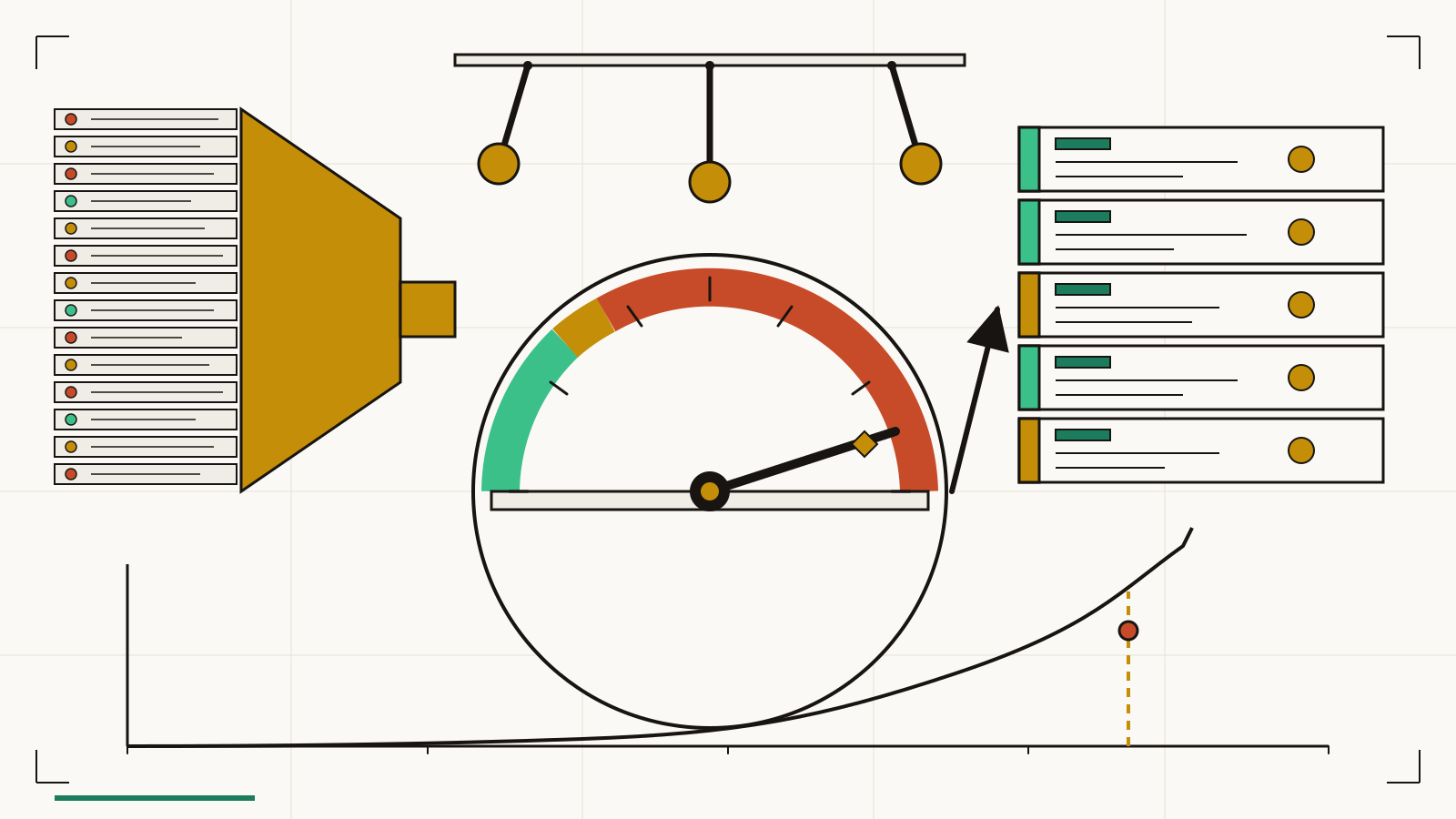
Arrivals are rising fast. Service rate is roughly flat. That gap is the whole program, and no dashboard resolves it, because the structural issue is not a prioritisation defect. It is a queue running above capacity. The right field for that problem is queueing theory, and we need to borrow its vocabulary wholesale before claiming anything of our own.
Three ancestors we are borrowing from, with credit
John Little's 1961 operations-research result relates the three quantities any queue has: L is the average number of items in the system, λ is the long-run arrival rate, and W is the average time an item spends inside, giving the identity L = λW. Donald Reinertsen's book, The Principles of Product Development Flow: Second Generation Lean Product Development (Reinertsen, 2009), carried operations-research results into product and engineering work, with cost of delay as the honest prioritiser and work-in-progress caps as the honest throttle. John Kingman's 1961 approximation for a general single-server queue, Kingman's formula, shows that mean wait time grows with a factor of ρ divided by (1 minus ρ), where ρ is utilisation, so wait time rises nonlinearly as the server approaches full use. Each of these predates vulnerability management by decades, and the mathematics in them is not ours. What we are adding is the vocabulary applied to vulnerability queues specifically, and the operating consequences a security leader can act on.
What Little's Law takes off the table
Little's Law is unforgiving. Backlog size equals arrival rate times time in system, so reordering the top ten items does nothing to the floor of the pile unless λ falls, W falls, or both. Risk-based prioritisation is still worth doing, because a smaller tail of high-exposure items clears faster when risk-weighted W drops, so the exposure the organisation actually carries goes down even if the raw count does not. But the raw count on the dashboard will not fall until one of the three structural quantities moves, and that is why so many programs feel like they are running to stand still: λ climbs, W holds, L grows.
The three levers that bend the curve
There are three levers, and only three, that move those quantities. The first is cutting arrivals. Deduplication across scanners, scope discipline on which assets even enter the queue, and exposure banding that routes low-signal findings away from the main lane all reduce effective λ without hiding real work. The second is raising service rate. Automation reduces per-ticket touch time, and batching by root cause converts many closures into one unit of work. The VulnCheck report plus Qualys 2026 TruRisk telemetry record a telling asymmetry: KEV vulnerability instances across their observed estate climbed from 68.7 million to 527.3 million over four years, roughly 7.7x, while the number of unique KEV CVEs grew far less. Our queues are dominated by repetition. One configuration change on a golden image can retire hundreds of instances; one SBOM-to-image rebuild can clear thousands. Per-finding grinding leaves that multiplier unused.
The third lever is queue discipline. Oldest-first makes the aging report look saner and the exposure picture worse, because yesterday's reachable CISA KEV finding sits behind last year's internal medium. Newest-reachable-first, graded by exposure band rather than age, moves the risk needle faster and makes the aging report look worse. The worse-looking aging report is the honest one, and the queue should be run against the honest report.
The utilisation trap, which is a 1961 result from Kingman
Here is where Kingman's result stops being an abstraction and starts explaining your Tuesday. For a general single-server queue with arrival variability ca and service variability cs, Kingman's approximation gives mean wait time scaling as (ρ over (1 minus ρ)) times ((ca squared plus cs squared) over 2) times mean service time. The ratio ρ over (1 minus ρ) is where almost all of the damage lives. A team running at 50 percent utilisation shows a wait coefficient of 1; by 80 percent it has climbed to 4, by 90 percent to 9, by 95 percent to 19. Nobody slacks between 80 and 95 percent utilisation, so the ratio does the damage on its own. Variability makes it worse on both sides, since vendor-advisory clusters cause arrival surges and uneven service times appear whenever one finding touches four teams while another touches one.
The practical reading is uncomfortable. A vulnerability program loaded near capacity shows pathological wait times even when every analyst does everything right. Visible slack on the service bench is the price of acceptable wait, not evidence of inefficiency, and "everyone is busy" is a signal to worry, not a signal to celebrate.
Cost of delay, and what gets pulled next
Reinertsen's cost of delay reframes the pulling rule. For each candidate finding, estimate the weekly risk cost of letting it sit (we omit money figures here on purpose; the ranking is what matters), divide by estimated service time, and pull the item with the highest cost-of-delay-divided-by-duration rank first. That ordering answers the one question a board asks: given scarcity, what gives us the most risk reduction per hour of engineer time this week? Severity sort cannot answer that. Combining CISA KEV presence, asset reachability, and service time can, and the reachability layers post describes how to compute the reachability input cheaply.
Report flow, not counts
The dashboard that hides a capacity problem reports counts. Open criticals, open highs, aging buckets, percentage closed. Each of those is a snapshot of L, the queue length, which Little's Law tells us is a product of two other quantities we never see on the same page. The dashboard that surfaces the capacity problem reports flow instead: arrival rate per week, service rate per week, their ratio ρ, variability of arrival and service, and mean W per class of finding. When ρ passes 0.85 the dashboard flashes before the backlog does; when ρ passes 0.95 the leadership gets a specific choice to make between adding capacity, cutting arrivals, or accepting the wait. Flow telemetry turns the queue into something a program can govern instead of apologise for. The vulnerability management control loop is the sensor-and-actuator view of this same shape, and this piece is the steady-state model that sits underneath it.
What the standards body already admitted
The decisive public evidence came on April 15, 2026, when NIST moved roughly 29,000 backlogged CVEs into Not Scheduled and published the criteria for what still receives enrichment. The standards body that owns the enrichment layer did the arithmetic, concluded linear catch-up was fantasy, and chose a date, a scope, and a filter. Patch backlog bankruptcy is the one-off reset procedure that follows; exposure debt is the accounting unit for what accumulates between resets. This piece is the steady-state model that keeps the next pile from forming.
Six weekly questions and two honest limits
A program running on queue economics asks six questions every week. What is λ this week, broken down by exposure band? Where does the team's service rate sit against the trailing month? Did ρ cross the Kingman threshold above 0.85, where wait time begins to climb nonlinearly? Which arrivals could be redirected or combined before they enter the queue at all? Which single service-rate improvement would move the needle most, and is that improvement operator time or batching gain? Under cost of delay divided by service time, which items should be pulled off the queue next? Those six answers fit on one page, which is more than most queue reports surface in a quarter.
Two honest limits apply. Kingman's formula assumes a G/G/1 queue, and a real security program is multi-class and multi-server with preemption, so the formula is directional rather than exact. Vulnerability work also has correlated service times across teams, since one advisory can create a thundering herd no single-server model captures. We accept both as approximations, already more useful than the counts-only report they replace.
CVEasy AI is the local-first CTEM platform we built so these flow measurements come straight off the environment, not from a vendor dashboard, and TRIS is the exposure-weighted score that feeds the cost-of-delay ranking the queue reads from.